Apple will introduce new Macs and the first services within its Apple Intelligence collection next week. To protect cloud-based requests made through Apple Intelligence, it has put industry-beating security and privacy protecting transparency in place around cloud-based requests handled by its Private Cloud Compute (PCC) system.
What that means is that Apple has pulled far ahead of the industry in a bid to build rock-solid protection around security and privacy for requests made of AI using Apple’s cloud. It’s an industry-leading move and is already delighting security researchers.
Why is that? It’s because Apple has opened the doors that secure its Private Cloud Compute systemwide to security testers in the hope that the energy of the entire infosec community will combine to help build a moat to protect the future of AI.
Make no mistake, this is what is at stake.
As AI promises to permeate everything, the choice we face is between a future of surveillance the likes of which we have never seen before, or the most powerful machine/human augmentation we can dream of. Server-based AI promises both these futures, even before mentioning that as quantum computing looms just a few hills and valleys away, the information picked up by non-private AI systems can be weaponized and exploited in ways we can’t even imagine.
That means to be secure tomorrow we must take steps today.
Protecting AI in the cloud
In part, protecting that future and ensuring it can say with total confidence that Apple Intelligence is the world’s most private and secure form of AI is what Apple is trying to do with PCC. This is the system that lets Apple run generative AI (genAI) models that need more processing power than available on the iPad, iPhone, or Mac you use to get things done. It’s the first port of call for these AI requests and has been deliberately designed to protect privacy and security. “You should not have to hand over all the details of your life to be warehoused and analyzed in someone’s AI cloud,” Apple Senior Vice President of Software Engineering Craig Federighi said when announcing PCC at WWDC.
The company promised that to “build public trust” in its cloud-based AI systems, it would allow security and privacy researchers to inspect and verify the end-to-end security and privacy of the system. The reason the security community is so excited is because Apple has exceeded that promise by making public all the resources it made available to researchers.
Security research for the rest of us
It provided the following resources:
The PCC Security Guide
Apple has published the PCC Security Guide, an extensive 100-page document including comprehensive technical details about the components of the system and how they work together to secure AI processing in the cloud. This is a deep guide that discusses built-in hardware protections and how the system handles various attack scenarios.
A Virtual Research Environment
The company has also created something security researchers might get excited about: A Virtual Research Environment (VRE) for the Apple platform. This consists of a set of tools that make it possible to perform your own security analysis of PCC using a Mac. This is a robust testing environment that runs a PCC node — basically a production machine — in a VM so you can beat it up as much as you like in search of security and privacy flaws.
You can use these tools to:
List and inspect PCC software releases.
Verify the consistency of the transparency log.
Download the binaries corresponding to each release.
Boot a release in a virtualized environment.
Perform inference against demonstration models.
Modify and debug the PCC software to enable deeper investigation.
Publishing the PCC source code
This is a big step in its own right and is provided under a license agreement that lets researchers dig deep for flaws. Within this set of information, the company has made source code that covers privacy, validation, and logging components. (All of this source code is available on GitHub now.)
Bounty hunters
Of course, the company understands that it must also incentivize researchers. To do so, Apple opened up a bounty system for those who succeed in finding flaws in the PCC code.
To contextualize the extent of this commitment, it is important to note that the value of these bounties is equal to what the company pays to researchers who discover iOS security flaws.
I believe that means Apple sees AI as a very important component to its future, PCC as an essential hub to drive forward to tomorrow, and that it will also now find some way to transform platform security using similar tools. Apple’s fearsome reputation for security means even its opponents have nothing but respect for the robust platforms it has made. That reputation is also why more and more enterprises are, or should be, moving to Apple’s platforms.
The mantle of protecting security is now under the passionate leadership of Ivan Krstić, who also led the design and implementation of key security tools such as Lockdown Mode, Advanced Data Protection for iCloud, and two-factor authentication for Apple ID. Krstić has previously promised that, “Apple runs one of the most sophisticated security engineering operations in the world, and we will continue to work tirelessly to protect our users from abusive state-sponsored actors like NSO Group.”
When it comes to bounties for uncovering flaws in PCC, researchers can now earn up to $1 million dollars if they find a weakness that allows arbitrary code execution with arbitrary entitlements, or a cool $250,000 if they uncover some way to access a user’s request data or sensitive information about their requests.
There are many other categories, and Apple seems really committed to ensuring it motivates even trivial discoveries: “Because we care deeply about any compromise to user privacy or security, we will consider any security issue that has a significant impact to PCC for an Apple Security Bounty reward, even if it doesn’t match a published category,” the company explains. Apple will award the biggest bounties for vulnerabilities that compromise user data and inference request data.
Apple’s gamble
It’s important to stress that in moving to deliver this degree of industry-leading transparency, Apple is gambling it can ensure that any weaknesses that do exist in its solution will be spotted and revealed, rather than being identified only to be sold on or weaponized.
The thinking is that while nation state-backed attackers might have access to resources that provide attackers with similar breadth of insight into Apple’s security protections, they will not share word of any such vulnerabilities with Apple. Such attackers, and those in the most well financed criminal or semi-criminal entities (within which I personally believe surveillance-as-a-service mercenaries belong), will spend time and money finding vulnerabilities in order to exploit them.
But there is a big world of security researchers who might also uncover weaknesses in the system who would be willing to share them, enabling Apple to patch vulnerabilities faster.
The way Apple sees it is that one way to ensure such vulnerabilities aren’t turned into privacy-destroying attacks is to make it so more people discover them at the same time; after all, even if one dodgy researcher chooses to use a weakness in an attack, another might disclose it to Apple early, effectively shutting down that route. In other words, by making these details available, Apple changes the game. In a strange irony, making these security protections open and available may well serve to make them more secure.
That’s the hope, anyway.
“We believe Private Cloud Compute is the most advanced security architecture ever deployed for cloud AI compute at scale, and we look forward to working with the research community to build trust in the system and make it even more secure and private over time,” Apple explained.
Why this matters
It is also a defining moment in security for AI. Why? Because Apple is an industry leader that sets expectations with its actions. With these actions, the company just defined the degree of transparency to which all companies offering cloud-based AI systems should now be held. If Apple can, they can, too. And any business or individual whose data or requests is being handled by cloud based AI systems can now legitimately demand that degree of transparency and protection. Apple is making waves again.
Humanoid robots from Tesla can “be a teacher, babysit your kids…, walk your dog, mow your lawn, get the groceries, just be your friend, serve drinks. Whatever you can think of, it will do,” said Elon Musk at this month’s Tesla “We, Robot” showcase in Burbank, CA.
To paraphrase: “Humanoid robots can be human, so you don’t have to!”
It’s a toxic and misguided vision for humanity — let me tell you why.
What is a robot, anyway?
When the public thinks of a robot, they think of a humanoid robot — an intelligent machine with feet, legs, knees, arms, a neck, a head, and a face — thanks to countless movies, TV shows, novels, and comics.
But what is a robot, really?
A robot is any computerized machine with sensors that gather information from its environment and can perform actions in the physical world based on that input. Robots’ attributes include autonomy, programmability, sensing capability, decision-making, and the ability to perform physical actions.
We talk about robots as a kind of future technology. But we’re surrounded by them every day.
The world of robots is big (so bear with me here); it includes consumer camera drones, smart thermostats, automated garage door openers, self-checkout kiosks, modern washing machines and dryers, robotic lawnmowers, automated pool cleaners, smart refrigerators, advanced coffee makers, automated pet feeders, and smart lighting systems.
There are robot vacuum cleaners, automated window blinds, automated dishwashers, smart ovens, self-service airport check-in kiosks, ATMs, advanced vending machines, adaptive traffic light systems, automated parking garage systems, modern HVAC systems, self-service library checkout systems, smart doorbells, advanced prosthetic limbs, automated subway or train systems, self-service bike rental kiosks, automated car washes, smart toilets, automated pill dispensers, modern pacemakers and implantable cardioverter-defibrillators, automated milking machines, self-balancing electric scooters, automated baggage handling systems, smart power grids, automated trading algorithms, and even modern hearing aids.
Our food is produced with the help of autonomous robot tractors, planting and seeding robots, weeding and pest control robots, automated greenhouse systems, harvesting robots, agricultural drones, soil analysis robots, cow-milking robots, palletizing robots, autonomous tractors, robotic sprayers, and inspection robots.
When you order a pack of batteries from Amazon.com, that order is facilitated by inventory management robots, mobile drive units for transporting goods, sorting robots, AI-driven robotic arms for item manipulation and package transfer, among others.
We are already totally reliant on robots for automotive manufacturing, electronics production, metal and machinery fabrication, plastics and chemical processing, construction, pharmaceutical manufacturing, healthcare, retail and hospitality, smart cities development, transportation, last-mile delivery, e-commerce, inspection and surveillance, and semiconductor production.
The belief that robots are always, usually, or even often humanoid is false. And the belief robots are coming in the future — well, as I just illustrated — is false, too.
We already live in an economy and society that is totally dependent upon thousands of different kinds of robots. They’re all around us, even if we don’t recognize them.
The future of robots
Meanwhile, two things are simultaneously happening. Existing jobs done by robots are constantly becoming ever more sophisticated, precise, efficient, and inexpensive.
Second, millions of tasks not previously performed by robots are being turned over to them and to robotic machinery. A diverse array of robotic devices will surely become commonplace over the next two decades.
The service sector will see a surge in delivery robots, streamlining last-mile package and food delivery logistics. Advanced cleaning robots will maintain both homes and commercial spaces.
Surgical robots performing minimally invasive procedures with high precision will benefit healthcare. Rehabilitation robots and exoskeletons will transform physical therapy and mobility, while robotic prosthetics will offer enhanced functionality to those who need them. At the microscopic level, nanorobots will revolutionize drug delivery and medical procedures.
Agriculture will increasingly embrace harvesting and planting robots to automate crop management, with specialized versions for tasks like weeding and dairy farming. Autonomous vehicles and drone delivery systems will transform the transportation sector, while robotic parking solutions will optimize urban spaces.
Military and defense applications will include reconnaissance drones, bomb disposal robots, and autonomous combat vehicles. Space exploration will continue to rely on advanced rovers, satellite-servicing robots, and assistants for astronauts on space stations.
Underwater exploration robots and devices monitoring air and water quality will benefit environmental and oceanic research. Specialized robots designed for search and rescue operations will aid disaster response efforts.
Emerging categories like soft robots, made from flexible materials, and swarm robots working collaboratively, will open new possibilities. AI-enhanced robots with advanced decision-making capabilities will become increasingly autonomous and adaptable.
In short, according to Nvidia CEO Jensen Huang (during a March 17 speech), “Everything is going to be robotic.”
When everything is robotic, what would humanoid robots do?
Musk’s prediction that humanoid robots will be teachers, babysitters, dog walkers, lawn mowers, grocery shoppers, bartenders, and friends showcases a toxic and misguided vision.
It’s misguided because nearly everything will already be robotic by the time Musk’s robots are capable of autonomous action. (To be clear, Tesla Optimus robots are nowhere near as advanced as Musk tried to make everyone believe at Tesla’s recent “We, Robot” event.
Consider, as one isolated example, the “robots will mow your lawn” claim. Musk imagines a bipedal humanoid robot in the front yard pushing a mower, an obviously ridiculous scenario.
Robotic mowers are already a banality. These appliances — sort of like Roomba vacuum cleaners, but for cutting grass instead of vacuuming floors — last for years and quietly and autonomously barber turf all day, avoiding flower beds and sidewalks without fail.
Current global sales exceed 1.5 million robotic mowers per year, at an average price of $1,200 — the same price as the cheapest Apple iPhone 16 Pro Max. Within five years, annual robotic lawn mower unit shipments are expected to reach seven million per year. Anyone with a little money and a distaste for mowing a lawn can buy one. There is no unmet need here for $50,000 humanoid robots.
This is also true for all the other jobs specified and unspecified by the Musks of the world. Robotic devices are already doing that work. So what’s left for humanoid robots to do?
The vision is toxic because, once you eliminate the tasks and jobs specialist robots will already be doing, what remains is the replacement of human connection. This very social and familial interaction is what makes us human.
Let’s start with dog walking. We get a dog so that we can enjoy the incredible connection that’s possible between a person and a dog. We feed a dog, pet a dog, hang out with a dog, and, yes, walk a dog because the experience of caring for a dog is clearly gratifying and meaningful for both species. Outsourcing our relationship with our dogs to an AI machine is (to be blunt) cold and horrible. We care for a dog for the bond and the relationship. We walk a dog in the morning for the ritual, for the exercise, and, above all, for the happiness that fulfilling the dog’s need to explore (and defecate) brings us.
Elderly companionship? Personal friendship? Education? Childcare? Why does anyone assume that a walking toaster fulfills the essential human need for empathy, connection, and care? People need to look into the sentient and conscious eyes of another human being. It’s literally the first and most basic human need.
The founder of the AI lab Midjourney, David Holz, posted on X in January that “we should be expecting a billion humanoid robots on earth in the 2040s and a hundred billion (mostly alien) robots throughout the solar system in the 2060s,” and Musk agreed with this post.
Such visionaries have what, to me, is clearly the wrong vision, and a disturbing one. We shouldn’t want AI robots to replace people in our lives and trick us into believing they’re human.
We should want non-humanoid robotic devices to do repetitive, dangerous, boring, and menial work so we can spend more time doing creative, fulfilling work and also spend more time with our parents, kids, and, yes, our pets.
Let the machines do the work. Let’s reserve our humanity for people and pets.
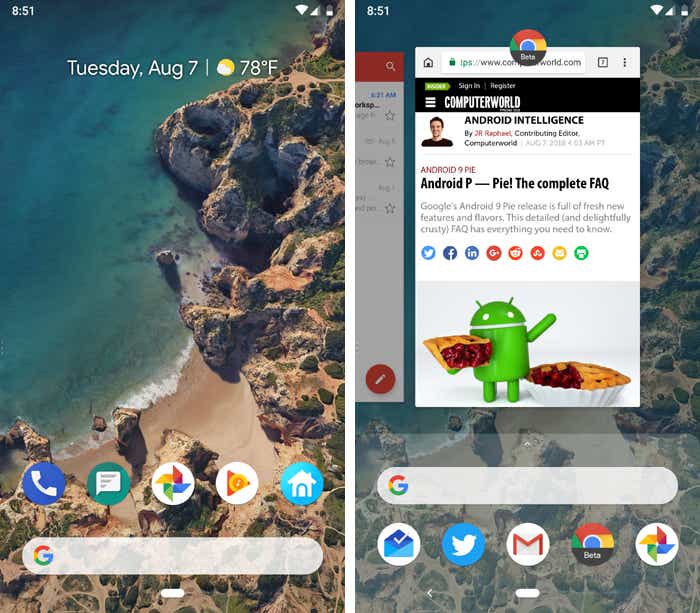
From its inaugural release to today, Android has transformed visually, conceptually and functionally — time and time again. Google’s mobile operating system may have started out scrappy, but holy moly, has it ever evolved.
Here’s a fast-paced tour of Android version highlights from the platform’s birth to present. (Feel free to skip ahead if you just want to see what’s new in the most recent Android 15 update.)
Android made its official public debut in 2008 with Android 1.0 — a release so ancient it didn’t even have a cute codename.
Things were pretty basic back then, but the software did include a suite of early Google apps like Gmail, Maps, Calendar, and YouTube, all of which were integrated into the operating system — a stark contrast to the more easily updatable standalone-app model employed today.
loading="lazy" width="400px">
The Android 1.0 home screen and its rudimentary web browser (not yet called Chrome).
T-Mobile
Android version 1.5: Cupcake
With early 2009’s Android 1.5 Cupcake release, the tradition of Android version names was born. Cupcake introduced numerous refinements to the Android interface, including the first on-screen keyboard — something that’d be necessary as phones moved away from the once-ubiquitous physical keyboard model.
Cupcake also brought about the framework for third-party app widgets, which would quickly turn into one of Android’s most distinguishing elements, and it provided the platform’s first-ever option for video recording.
Android 1.6, Donut, rolled into the world in the fall of 2009. Donut filled in some important holes in Android’s center, including the ability for the OS to operate on a variety of different screen sizes and resolutions — a factor that’d be critical in the years to come. It also added support for CDMA networks like Verizon, which would play a key role in Android’s imminent explosion.
loading="lazy" width="400px">
Android’s universal search box made its first appearance in Android 1.6.
Google
Android versions 2.0 to 2.1: Eclair
Keeping up the breakneck release pace of Android’s early years, Android 2.0, Eclair, emerged just six weeks after Donut; its “point-one” update, also called Eclair, came out a couple months later. Eclair was the first Android release to enter mainstream consciousness thanks to the original Motorola Droid phone and the massive Verizon-led marketing campaign surrounding it.
Verizon’s “iDon’t” ad for the Droid.
The release’s most transformative element was the addition of voice-guided turn-by-turn navigation and real-time traffic info — something previously unheard of (and still essentially unmatched) in the smartphone world. Navigation aside, Eclair brought live wallpapers to Android as well as the platform’s first speech-to-text function. And it made waves for injecting the once-iOS-exclusive pinch-to-zoom capability into Android — a move often seen as the spark that ignited Apple’s long-lasting “thermonuclear war” against Google.
loading="lazy" width="400px">
The first versions of turn-by-turn navigation and speech-to-text, in Eclair.
Google
Android version 2.2: Froyo
Just four months after Android 2.1 arrived, Google served up Android 2.2, Froyo, which revolved largely around under-the-hood performance improvements.
Froyo did deliver some important front-facing features, though, including the addition of the now-standard dock at the bottom of the home screen as well as the first incarnation of Voice Actions, which allowed you to perform basic functions like getting directions and making notes by tapping an icon and then speaking a command.
loading="lazy" width="400px">
Google’s first real attempt at voice control, in Froyo.
Google
Notably, Froyo also brought support for Flash to Android’s web browser — an option that was significant both because of the widespread use of Flash at the time and because of Apple’s adamant stance against supporting it on its own mobile devices. Apple would eventually win, of course, and Flash would become far less common. But back when it was still everywhere, being able to access the full web without any black holes was a genuine advantage only Android could offer.
Android version 2.3: Gingerbread
Android’s first true visual identity started coming into focus with 2010’s Gingerbread release. Bright green had long been the color of Android’s robot mascot, and with Gingerbread, it became an integral part of the operating system’s appearance. Black and green seeped all over the UI as Android started its slow march toward distinctive design.
loading="lazy" width="400px">
It was easy being green back in the Gingerbread days.
JR Raphael / IDG
Android 3.0 to 3.2: Honeycomb
2011’s Honeycomb period was a weird time for Android. Android 3.0 came into the world as a tablet-only release to accompany the launch of the Motorola Xoom, and through the subsequent 3.1 and 3.2 updates, it remained a tablet-exclusive (and closed-source) entity.
Under the guidance of newly arrived design chief Matias Duarte, Honeycomb introduced a dramatically reimagined UI for Android. It had a space-like “holographic” design that traded the platform’s trademark green for blue and placed an emphasis on making the most of a tablet’s screen space.
loading="lazy" width="400px">
Honeycomb: When Android got a case of the holographic blues.
JR Raphael / IDG
While the concept of a tablet-specific interface didn’t last long, many of Honeycomb’s ideas laid the groundwork for the Android we know today. The software was the first to use on-screen buttons for Android’s main navigational commands; it marked the beginning of the end for the permanent overflow-menu button; and it introduced the concept of a card-like UI with its take on the Recent Apps list.
Android version 4.0: Ice Cream Sandwich
With Honeycomb acting as the bridge from old to new, Ice Cream Sandwich — also released in 2011 — served as the platform’s official entry into the era of modern design. The release refined the visual concepts introduced with Honeycomb and reunited tablets and phones with a single, unified UI vision.
ICS dropped much of Honeycomb’s “holographic” appearance but kept its use of blue as a system-wide highlight. And it carried over core system elements like on-screen buttons and a card-like appearance for app-switching.
loading="lazy" width="400px">
The ICS home screen and app-switching interface.
JR Raphael / IDG
Android 4.0 also made swiping a more integral method of getting around the operating system, with the then-revolutionary-feeling ability to swipe away things like notifications and recent apps. And it started the slow process of bringing a standardized design framework — known as “Holo” — all throughout the OS and into Android’s app ecosystem.
Android versions 4.1 to 4.3: Jelly Bean
Spread across three impactful Android versions, 2012 and 2013’s Jelly Bean releases took ICS’s fresh foundation and made meaningful strides in fine-tuning and building upon it. The releases added plenty of poise and polish into the operating system and went a long way in making Android more inviting for the average user.
Visuals aside, Jelly Bean brought about our first taste of Google Now — the spectacular predictive-intelligence utility that’s sadly since devolved into a glorified news feed. It gave us expandable and interactive notifications, an expanded voice search system, and a more advanced system for displaying search results in general, with a focus on card-based results that attempted to answer questions directly.
Multiuser support also came into play, albeit on tablets only at this point, and an early version of Android’s Quick Settings panel made its first appearance. Jelly Bean ushered in a heavily hyped system for placing widgets on your lock screen, too — one that, like so many Android features over the years, quietly disappeared a couple years later.
Late-2013’s KitKat release marked the end of Android’s dark era, as the blacks of Gingerbread and the blues of Honeycomb finally made their way out of the operating system. Lighter backgrounds and more neutral highlights took their places, with a transparent status bar and white icons giving the OS a more contemporary appearance.
Android 4.4 also saw the first version of “OK, Google” support — but in KitKat, the hands-free activation prompt worked only when your screen was already on and you were either at your home screen or inside the Google app.
The release was Google’s first foray into claiming a full panel of the home screen for its services, too — at least, for users of its own Nexus phones and those who chose to download its first-ever standalone launcher.
loading="lazy" width="400px">
The lightened KitKat home screen and its dedicated Google Now panel.
JR Raphael / IDG
Android versions 5.0 and 5.1: Lollipop
Google essentially reinvented Android — again — with its Android 5.0 Lollipop release in the fall of 2014. Lollipop launched the still-present-today Material Design standard, which brought a whole new look that extended across all of Android, its apps and even other Google products.
The card-based concept that had been scattered throughout Android became a core UI pattern — one that would guide the appearance of everything from notifications, which now showed up on the lock screen for at-a-glance access, to the Recent Apps list, which took on an unabashedly card-based appearance.
loading="lazy" width="400px">
Lollipop and the onset of Material Design.
JR Raphael / IDG
Lollipop introduced a slew of new features into Android, including truly hands-free voice control via the “OK, Google” command, support for multiple users on phones and a priority mode for better notification management. It changed so much, unfortunately, that it also introduced a bunch of troubling bugs, many of which wouldn’t be fully ironed out until the following year’s 5.1 release.
Android version 6.0: Marshmallow
In the grand scheme of things, 2015’s Marshmallow was a fairly minor Android release — one that seemed more like a 0.1-level update than anything deserving of a full number bump. But it started the trend of Google releasing one major Android version per year and that version always receiving its own whole number.
Marshmallow’s most attention-grabbing element was a screen-search feature called Now On Tap — something that, as I said at the time, had tons of potential that wasn’t fully tapped. Google never quite perfected the system and ended up quietly retiring its brand and moving it out of the forefront the following year.
loading="lazy" width="400px">
Marshmallow and the almost-brilliance of Google Now on Tap.
JR Raphael / IDG
Android 6.0 did introduce some stuff with lasting impact, though, including more granular app permissions, support for fingerprint readers, and support for USB-C.
Android 7.0 Nougat and its new native split-screen mode.
JR Raphael / IDG
Perhaps most pivotal among Nougat’s enhancements, however, was the launch of the Google Assistant — which came alongside the announcement of Google’s first fully self-made phone, the Pixel, about two months after Nougat’s debut. The Assistant would go on to become a critical component of Android and most other Google products and is arguably the company’s foremost effort today.
Android version 8.0 and 8.1: Oreo
Android Oreo added a variety of niceties to the platform, including a native picture-in-picture mode, a notification snoozing option, and notification channels that offer fine control over how apps can alert you.
loading="lazy" width="400px">
Oreo adds several significant features to the operating system, including a new picture-in-picture mode.
JR Raphael / IDG
The 2017 release also included some noteworthy elements that furthered Google’s goal of aligning Android and Chrome OS and improving the experience of using Android apps on Chromebooks, and it was the first Android version to feature Project Treble — an ambitious effort to create a modular base for Android’s code with the hope of making it easier for device-makers to provide timely software updates.
Android version 9: Pie
The freshly baked scent of Android Pie, a.k.a. Android 9, wafted into the Android ecosystem in August of 2018. Pie’s most transformative change was its hybrid gesture/button navigation system, which traded Android’s traditional Back, Home, and Overview keys for a large, multifunctional Home button and a small Back button that appeared alongside it as needed.
Android 9 introduced a new gesture-driven system for getting around phones, with an elongated Home button and a small Back button that appears as needed.
Google released Android 10 — the first Android version to shed its letter and be known simply by a number, with no dessert-themed moniker attached — in September of 2019. Most noticeably, the software brought about a totally reimagined interface for Android gestures, this time doing away with the tappable Back button altogether and relying on a completely swipe-driven approach to system navigation.
Android 10 packed plenty of other quietly important improvements, including an updated permissions system with more granular control over location data along with a new system-wide dark theme, a new distraction-limiting Focus Mode, and a new on-demand live captioning system for any actively playing media.
Android 10’s new privacy permissions model adds some much-needed nuance into the realm of location data.
JR Raphael / IDG
Android version 11
Android 11, launched at the start of September 2020, was a pretty substantial Android update both under the hood and on the surface. The version’s most significant changes revolve around privacy: The update built upon the expanded permissions system introduced in Android 10 and added in the option to grant apps location, camera, and microphone permissions only on a limited, single-use basis.
Android 11 also made it more difficult for apps to request the ability to detect your location in the background, and it introduced a feature that automatically revokes permissions from any apps you haven’t opened lately. On the interface level, Android 11 included a refined approach to conversation-related notifications along with a new streamlined media player, a new Notification History section, a native screen-recording feature, and a system-level menu of connected-device controls.
Android 11’s new media player appears as part of the system Quick Settings panel, while the new connected-device control screen comes up whenever you press and hold your phone’s physical power button.
JR Raphael / IDG
Android version 12
Google officially launched the final version of Android 12 in October 2021, alongside the launch of its Pixel 6 and Pixel 6 Pro phones.
In a twist from the previous several Android versions, the most significant progressions with Android 12 were mostly on the surface. Android 12 featured the biggest reimagining of Android’s interface since 2014’s Android 5.0 (Lollipop) version, with an updated design standard known as Material You — which revolves around the idea of you customizing the appearance of your device with dynamically generated themes based on your current wallpaper colors. Those themes automatically change anytime your wallpaper changes, and they extend throughout the entire operating system interface and even into the interfaces of apps that support the standard.
Android 12 ushered in a whole new look and feel for the operating system, with an emphasis on simple color customization.
Google
Surface-level elements aside, Android 12 brought a (long overdue) renewed focus to Android’s widget system along with a host of important foundational enhancements in the areas of performance, security, and privacy. The update provided more powerful and accessible controls over how different apps are using your data and how much information you allow apps to access, for instance, and it included a new isolated section of the operating system that allows AI features to operate entirely on a device, without any potential for network access or data exposure.
Android version 13
Android 13, launched in August 2022, was simultaneously one of the most ambitious updates in Android history and one of the most subtle version changes to date.
On tablets and foldable phones, Android 13 introduced a slew of significant interface updates and additions aimed at improving the large-screen Android experience — including an enhanced split-screen mode for multitasking and a ChromeOS-like taskbar for easy app access from anywhere.
The new Android-13-introduced taskbar, as seen on a Google Pixel Fold phone.
Google
On regular phones, Android 13 brought about far less noticeable changes — mostly just some enhancements to the system clipboard interface, a new native QR code scanning function within the Android Quick Settings area, and a smattering of under-the-hood improvements.
Android version 14
Following a full eight months of out-in-the-open refinement, Google’s 14th Android version landed at the start of October 2023 in the midst of the company’s Pixel 8 and Pixel 8 Pro launch event.
But despite the subtle nature of its first impression, Android 14 includes a fair amount of noteworthy new stuff. The software introduces a new system for dragging and dropping text between apps, for instance, as well as a new series of native customization options for the Android lock screen.
Android 14 includes options for completely changing the appearance of the lock screen as well as for customizing which shortcuts show up on it.
JR Raphael / IDG
Android 14 provides a number of new improvements to privacy and security, too, including a new settings-integrated dashboard for managing all your health and fitness data and controlling which apps and devices can access it. And it adds in a more info-rich and context-requiring system for seeing exactly why apps want access to your location when they request such a permission.
Beyond that, Android 14 features a first taste of Google’s AI-generated custom wallpaper creator, though that’s available only on the Pixel 8 and Pixel 8 Pro to start.
You can generate all sorts of interesting wallpapers in seconds via Android 14’s AI generator feature — but only on the Pixel 8 or Pixel 8 Pro for now.
JR Raphael / IDG
The software also sports a series of significant accessibility additions, such as an enhanced on-demand magnifier, an easier way to increase font size in any app, improved support for hearing aid connections, and a built-in option to have your phone flash its camera light anytime a new notification arrives.
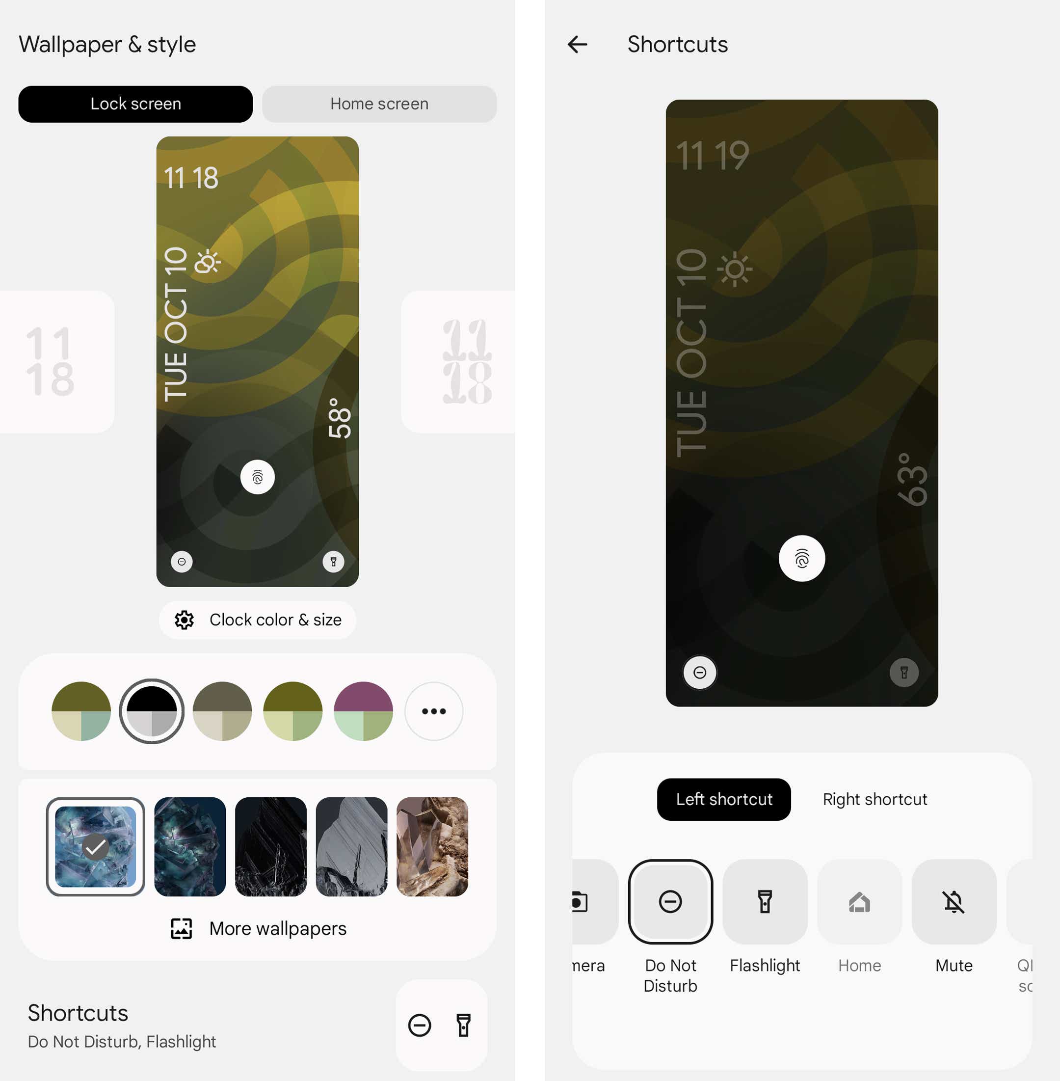
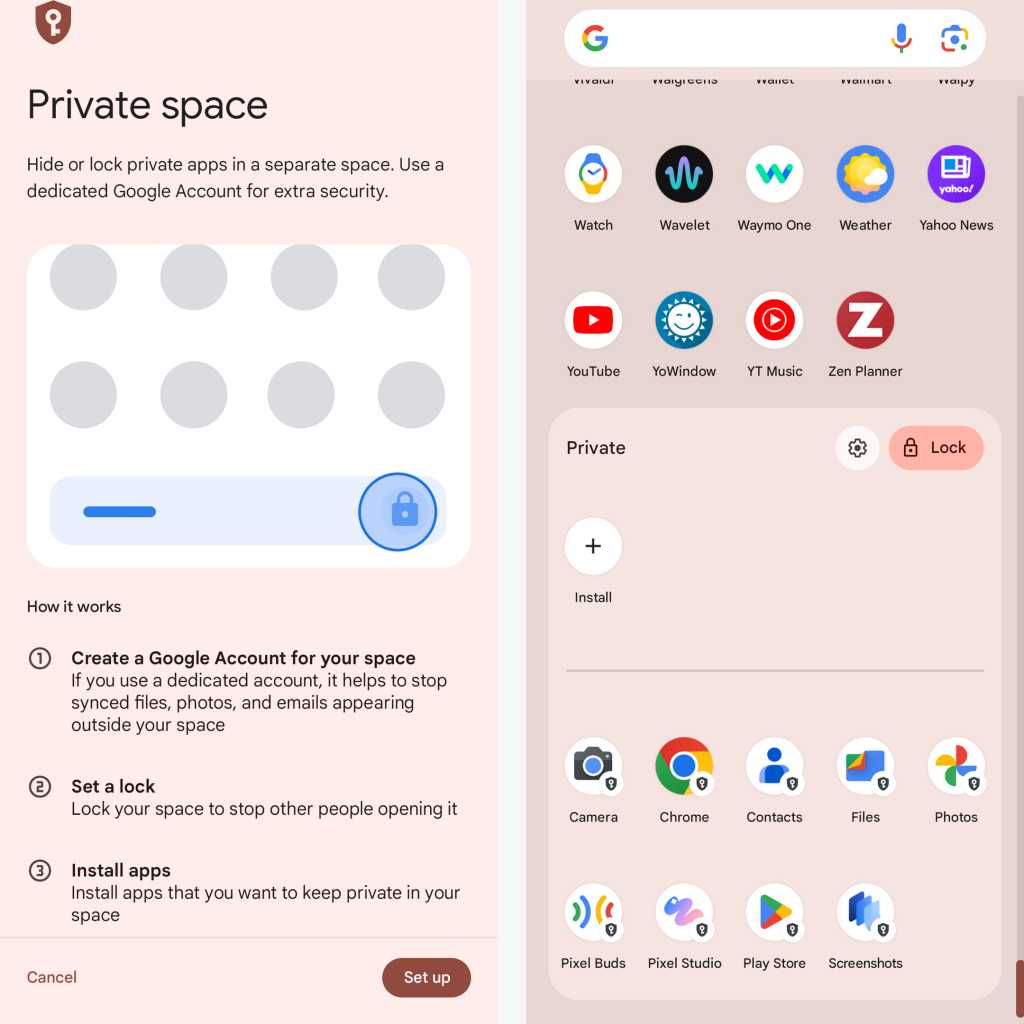
Android version 15
Google technically released Android 15 in September 2024, but in an unusual twist, that was only the launch of the software’s raw source code. The new Android version didn’t show up even on the company’s own Pixel devices until just over a month later, in mid-October.
As for Android 15 itself, though, the update introduces a number of noteworthy new features — including a system-level Private Space option that lets you keep sensitive apps out of sight and accessible only with authentication. The software also further enhances the multitasking systems introduced in Android 13 with the new option to keep the large-screen-exclusive Android taskbar present at all times and the new ability to launch specific pairs of apps together into a side-by-side split-screen with a single tap.
Once you set up Android 15’s new Private Space feature, certain apps appear in a special protected — and optionally hidden — area of your app drawer.
JR Raphael / IDG
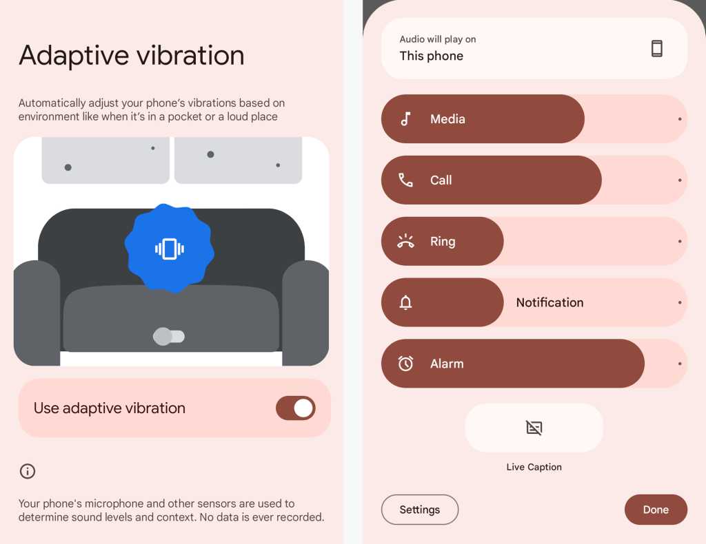
Beyond that, Android 15 includes a redesigned system volume panel, a new option to automatically reenable a device’s Bluetooth radio a day after it’s been disabled, and a Pixel-specific Adaptive Vibration feature that intelligently adjusts a phone’s vibration intensity based on the environment.
Adaptive Vibration and a redesigned volume panel provide welcome upgrades to the Android audio experience.
JR Raphael / IDG
Add in a new charging-time connected-device-control screen saver, a space-saving app archiving option for infrequently used apps, and a long-under-development predictive back visual that lets you see a peek at where you’re headed before you get there — and this small-seeming update is actually shaping up to be a pretty hefty update progression.
This article was originally published in November 2017 and most recently updated in October 2024.
When the European Commission ruled in 2009 that Intel had broken European Union antitrust laws and fined it €1.06 billion (US$1.44 billion at the time), it was just the beginning of a 15-year saga.
That saga ended Thursday with the European Court of Justice dismissing the Commission’s appeal of an earlier judgement against it, and ordering it to pay all costs. Intel is now off the hook for that billion-euro fine, now worth US$1.15 billion at current exchange rates.
The story began with an investigation into alleged anti-competitive practices by Intel that resulted in the 2009 judgement in which the Commission ruled that the company had engaged in practices to exclude competitors from the semiconductor market, citing rebates granted to computer manufacturers on the condition that they buy all or most of their processors from Intel.
In its judgement, the Commission fined Intel €1.06 billion and ordered it to cease the business practices it had deemed illegal at once.
Intel immediately said it would appeal.
In 2014, Intel lost its appeal of the ruling and was ordered by the EU’s General Court to comply with the conditions of the 2009 judgement. However, it had two months to challenge the decision based on points of law, and it duly filed an appeal with the Court of Justice.
In 2017, the Court of Justice tossed out the Commission’s judgement, saying that the General Court did not examine all of Intel’s arguments as it was required to do. “The Court therefore sets aside the judgment of the General Court as a result of that failure in its analysis,” it concluded, referring the case back to the General Court “to examine, in the light of the arguments put forward by Intel, whether the rebates at issue are capable of restricting competition.”
But that wasn’t the end of it.
In 2022, the General Court, after thoroughly reviewing the arguments from both sides, ruled, “the analysis carried out by the Commission is incomplete and, in any event, does not make it possible to establish to the requisite legal standard that the rebates at issue were capable of having, or were likely to have, anticompetitive effects, which is why the General Court annuls the decision.”
Although it only annulled part of its original decision, it concluded that it could not identify how much of the fine relate to that part of the decision, and how much to the part it upheld, and so decided to annul the fine in its entirety.
The Commission was not pleased with this ruling and, supported by the Federal Republic of Germany, appealed.
Which brings us to the current ruling, which eliminated the fine and ordered Germany and the Commission to pay their own costs and those of Intel and its intervenors, the Association for Competitive Technology and the French consumer rights group Union Fédérale des Consommateurs – Que Choisir.
After the decision’s announcement, Intel issued a brief statement, saying “We are pleased with the judgment delivered by the Court of Justice of the European Union today and to finally put this part of the case behind us.”
A good day
While the judgement was good news for Intel, analysts feel that it still isn’t out of the woods.
“Any day when you don’t have to pay a €1.06 billion fine has got to feel like a good day, so for beleaguered tech giant Intel, you’d think this would be an awesome day!” said John Annand, practice lead at Info-Tech Research Group, in an email. “Intel has had a bit of an optics problem lately with persistent chip defects in their high-end processors, disappointing quarterly financials and manufacturing quality control problems plaguing their foundry business. These same fabs [chip fabrication facilities] that Pat Gelsinger has pointed to as the key to Intel’s long-term success and that he’s been so effective at securing US Federal grant money to have them built on American soil. It would be very bad optics indeed if Intel could be seen as using US government grant money to pay a European Union fine.”
Anshel Sag, VP & principal analyst, Moor Insights & Strategy, also noted that it would have been difficult proving lasting competitive harm.
“While I do believe that European regulators believe they have the consumers best interests in mind, they are at times a bit gung-ho,” Sag said in an email. “I believe that part of the ruling’s purpose was to establish better competition and ensure a more level playing field, and considering the market conditions with AMD, Nvidia and Qualcomm giving Intel real competition, it may be harder to prove the lasting harm some of these policies may have caused. That said, it definitely seems interesting that this still was in the courts and has been dragged out so long that the legal fees must be astronomical.”
Although Intel has finally prevailed, Annand said, it still has a long way to go in today’s marketplace.
“It’s not all upside. Intel appealed this decision back in 2009 arguing that the ‘reality of a highly competitive marketplace, characterized by constant innovation, improved product performance and lower prices,’” he said. “How true those words were! Who in 2009 would have foreseen the realities of the current marketplace? Nvidia, Arm, Qualcomm TSMC, even Broadcom, [are] challenging and eclipsing a once perceived monopolistic player.”
A move by the UK’s Competition and Markets Authority (CMA) to formally launch a probe into Google’s purchase of a $2 billion stake in Anthropic, “sounds like a precautionary investigation across the board to me, primarily due to the fact that the CMA just recently approved Amazon’s Anthropic investment and partnership,” an industry analyst said Thursday.
Scott Bickley, advisory fellow at Info-Tech Research Group, said, “on the surface, the deal with Google seems materially similar in nature. Both Microsoft and Alphabet/Google are now being scrutinized for their respective partnerships with OpenAI and Anthropic by the CMA. The inquiry into Google may merit a closer look, however, in light of the DOJ’s recent finding against the company’s anti-competitive practices in the areas of search and advertising.”
The CMA, in a statement released Thursday, indicated that it had obtained “sufficient information” to launch a preliminary investigation into the investment by Google, which was first announced last year and involved an initial investment of $500 million, with the remainder to be invested at a later date.
Once the preliminary investigation is completed, on Dec. 19 the regulator will announce whether or not a more detailed phase 2 probe will take place.
Bickley said he suspects “the CMA would be looking for unfair advantages via the coupling of AI-powered capabilities layered over their existing search capabilities and advertising services, which would further enhance their market dominance. Any finding at this point would be premature, as Alphabet has not implemented services in this manner.”
Last March, Amazon announced it was investing $2.75 billion in Anthropic, bringing its total investment in the AI startup to $4 billion.
As part of this partnership, Anthropic said it would use Amazon Web Services (AWS) as its main cloud provider for key operations, including safety research and the development of foundational models. It will also use AWS Trainium and Inferentia chips for building, training, and deploying future models.
The CMA ruling on that investment was released on Sept. 27 and stated that the regulator does not believe that a “relevant merger situation has been created.”
Phil Brunkard, executive counselor at Info-Tech Research Group UK, said, “both Google and Amazon are trying to compete with OpenAI, but it’s interesting that the CMA is focusing on Google when Amazon was just cleared, which raises some questions about consistency.”
While investigations do create some uncertainty, he said, ”Amazon’s clearance hints that Google could have a similar outcome. It seems the CMA is just being thorough, but these investments will likely continue.”
Brunkard said he sees “a two-horse race” forming: Microsoft/OpenAI vs. Google/Amazon and Anthropic, “though I believe a third player could enhance competition. Despite the hurdles, Big Tech will likely drive ahead, and Google or Amazon backing is a solid sign of Anthropic’s potential. Customer confidence in AI startups is likely to be increasingly shaped by the companies that Big Tech chooses to invest in.”
Meanwhile, a spokesperson for the Computer and Communications Industry Association, in a move that was not surprising as the organization is funded by an array of large technology firms, on Thursday criticized the move by the CMA.
Matthew Sinclair, senior director, UK, with the group, said, “another investigation by the competition regulator will create fresh uncertainty for a business that remains a challenger in a dynamic AI sector. Premature competition interventions will make it harder for new AI businesses to collaborate, innovate, and grow.”
The CMA first launched an initial review into the market for AI systems in May 2023, and, in a statement, announced it would focus in on three key areas: how the competitive markets for foundational models and their use could evolve; the opportunities and risks these scenarios could bring for competition and consumer protection; and what guiding principles should be introduced to support competition and protect consumers as AI models develop.
The organization added that the review is in line with the UK government’s aim to support “open, competitive markets.”
In a first, US President Joseph R. Biden Jr. issued a national security memorandum today telling federal intelligence agencies they need to pilot and deploy artificial intelligence (AI) in an effort to boost the nation’s security.
The memo is directed at the National Security Agency, the Federal Bureau of Investigation, the Department of Defense, and the Department of Energy and specifically tells the agencies to use AI to track and counter adversaries’ development and use of the technology.
The edict also directs the agencies to ensure AI adoption “reflects democratic values and protects human rights, civil rights, civil liberties and privacy.” The plan is to coordinate efforts with US allies “to ensure the technology is developed and used in ways that adhere to international law while protecting human rights and fundamental freedoms.”
Joel Meyer, president of public products at AI services provider Domino Data Lab, said the memo is obviously aimed at preventing US adversaries from achieving “overmatch” by making the integration and application of AI in US military and national security capabilities an urgent priority.
“This memo takes an important step in both accelerating innovation and adoption and in ensuring that use is responsible and governed by putting in place guardrails for how US government agencies can, and just as importantly cannot, use AI,” Meyer said.
For example, Meyer said, the US Navy’s Project AMMO uses AI to support underwater target threat detection and to provide underwater drone operators with feedback data to increase operator confidence. “The [memo] builds a foundation of trust that allows programs like this one to scale by both accelerating innovation and adoption and ensuring that use is responsible and governed,” Meyer said.
“Our competitors want to upend US AI leadership and have employed economic and technological espionage in efforts to steal US technology,” the memo states. “This [order] makes collection on our competitors’ operations against our AI sector a top-tier intelligence priority, and directs relevant US Government entities to provide AI developers with the timely cybersecurity and counterintelligence information necessary to keep their inventions secure.”
The memo directs actions to improve the security and diversity of chip supply chains, and to ensure that, as the US supports the development of the next generation of government supercomputers and other emerging technology, the nation does so with AI in mind.
The government’s AI efforts will be overseen by the existing AI Safety Institute, which is housed within the National Institute of Standards and Technology (NIST) in Gaithersburg, MD. The White House said it’s the one body staffed by technical experts who understand the quickly evolving technology.
The order also lays out strengthened and streamlined mechanisms for the AI Safety Institute to partner with national security agencies, including the intelligence community, the Defense Department, and the Department of Energy.
Microsoft recently rolled out Windows 11 version 24H2 and, though there are some bugs in the update, the company is outlining on its Windows IT Pro blog that the management of updates has been significantly improved.
Among other changes the company highlighted, users should find that installing updates is now up to 46% faster; the time required to restart the computer is up to 40% less; and CPU usage should be up to 25% less than in the past.
Microsoft also rolled out various optimizations to Windows 11 that mean the updates do not take up as much storage space as before.
Reports Apple is closing down Vision Pro production seem counter intuitive, given that in the last few days, Cisco and Vimeo have both released software for the high-tech headset, which is also now being used for pilot training.
At $3,500, the device was never expected to be a mass market product, as Apple CEO Tim Cook agrees. But it certainly continues to make its mark in enterprise computing — as well as offering big promise to entertainment.
The Information has a report in which it claims Apple has told its Vision Pro assembler, Luxshare, that it might need to wind down production in November. The report also cites sources from component suppliers that claim parts production for the device has also been reduced. The implication would suggest Apple thinks it has enough inventory on hand to meet demand, at least for a while.
Are sales slowing? The report suggests maybe, and the data points it provides include:
Production scale-backs began this past summer.
Enough components have been manufactured to create just over half a million headsets.
Some component suppliers ceased production in May.
Luxshare makes around 1,000 of the headsets each day, half the production peak.
All in all, the picture painted maintains the narrative we’ve seen since before the launch of Vision Pro — that it’s too expensive for the mass market. But, as Cook said just before the Information was published, Apple knows this already: “At $3,500, it’s not a mass-market product,” he said. “Right now, it’s an early-adopter product. People who want to have tomorrow’s technology today—- that’s who it’s for. Fortunately, there’s enough people who are in that camp that it’s exciting.”
Who’s excited now?
We know the enterprise market is most excited about the potential of Vision Pro. We’ve heard multiple reports explaining its use in various industries, including during surgery. Just this week, Cisco introduced Cisco Spatial Meetings for the Vision Pro, which builds greatly on the Webex support the company already provides for the Apple product.
For consumers, Vimeo this week did what YouTube has not, introducing an app that lets its users create, view, and share spatial videos. “This kind of spatial content is the future of storytelling, and we’re proud to be at the forefront of this revolution,” said Vimeo CEO Philip Moyer.
Apple does seem to have succeeded in igniting interest among some unique usage scenarios. One that most caught my eye this week comes from CAE and is an immersive pilot training app for the device. This app has been designed so pilots can familiarize themselves with in-flight controls before they begin training flights. In recent weeks, we’ve also seen implementations in training, sales and marketing, medicine, engineering and beyond. Those are the people using tomorrow’s technology today at this time. While there are developers, Apple enthusiasts, and bored rich people spending on these devices, the biggest interest in them, as I’ve always said, is coming from the enterprise.
As the recent multi-million-dollar investment in a content delivery network for mass market spatial reality experiences shows, that’s going to change….
Waiting for tomorrow
Apple’s first calendar quarter is traditionally its slowest. With that in mind, it makes sense for Apple to slow manufacturing of its edgiest device in preparation for a muted sales season. Potentially shuttering production in November makes sense through that lens — particularly as Apple is expected to introduce a lower-cost device that also runs visionOS, which is what we’ve all anticipated for months. The Information once again confirms this theory — and also says development of a second generation “Pro” device has been delayed for a year, which was rumored before.
The report, however, also claims Apple might release what is described as an “incremental” updated to Vision Pro with limited changes, “such as a chip upgrade.”
Given the Vision Pro runs an M2 Apple processor, it makes sense to gloss it up a little with an M4, particularly as Apple is likely to introduce new Apple Intelligence features to visionOS next year. But 2025 is also when Apple is expected to introduce a smaller, more compact, and less expensive visionOS-powered system, one that potentially uses an iPhone as the CPU.
In other words, while there’s little doubt that introducing Vision Pro to a world battered by savage conflicts, accelerating energy costs, and political instability means Apple m ight not have met the lofty sales targets it originally aspired to meet, the idea that Apple is abandoning the product is far-fetched.
Production targets may have been lowered for now, but this is only the lull before the rollout of a more affordable product more of us can explore. I expect intimations of this as soon as WWDC 2025.
As PC, chip, and other component makers unveil products tailored to generative artificial intelligence (genAI) needs on edge devices, users can expect to see far more task automation and copilot-like assistants embedded on desktops and laptops next year.
PC and chip manufacturers — including AMD, Dell, HP, Lenovo, Intel, and Nvidia — have all been touting AI PC innovations to come over the next year or so. Those announcements come during a crucial timeframe for Windows users: Windows 10 will hit its support end of life next October.
Forrester Research defines an AI PC as one that has an embedded AI processor and algorithms specifically designed to improve the experience of AI workloads across the central processing unit (CPU), graphics processing unit (GPU), and neural processing unit, or NPU. (NPUs allow the PCs to run AI algorithms at lightning-fast speeds by offloading specific functions.)
“While employees have run AI on client operating systems (OS) for years — think background blur or noise cancellation — most AI processing still happens within cloud services such as Microsoft Teams,” Forrester explained in a report. “AI PCs are now disrupting the cloud-only AI model to bring that processing to local devices running any OS.”
Forrester has tagged 2025 “the Year of the AI PC” — and if the number of recent product announcements is any indication, that’s likely to be the case.
Gartner Research projects PC shipments will grow by 1.6% in 2024 and by 7.7% in 2025. The biggest growth driver will be due, not the arrival of not AI PCs, but to the need by many companies and users to refresh their computers and move toward Windows 11.
“Our assumption is that [AI PCs] will not drive shipment growth, meaning that most end users won’t replace their PCs because they want to have the AI. They will happen to select [an AI PC] if they will replace their PCs for specific reasons — e.g., OS upgrade, aging PCs, or a new school or job, and most importantly, the price is right for them,” said Gartner analyst Mika Kitagawa.
The biggest impact of AI PCs on the industry will be revenue growth due to changes in the components, such as adding an NPU core and more considerable memory requirements. AI PCs are also likely to boost application service provider and end-user spending. Gartner predicts end-user spending will rise 5.4% this year and jump 11.6% in 2025, a growth rate that will outpace AI PC shipment growth.
“In five years, the [AI PC] will become a standard PC configuration, and the majority of PCs will have an NPU core,” Kitagawa said.
Tom Mainelli, an IDC Research group vice president, noted that across the silicon ecosystem there are already systems-on-chips (SoCs) with NPUs from Apple, AMD, Intel, and Qualcomm. “Apple led the charge with its M Series, which has included an NPU since arriving on the Mac in 2020,” he said.
“To date, neither the operating systems — Windows or macOS — nor the apps people use have really leveraged the NPU,” Mainelli said. “But that is beginning to change, and we will see a big upswing in OSes and apps beginning to leverage the benefits of running AI locally, versus in the cloud, as the installed base of systems continues to grow.”
Windows 11 has several genAI features built in, and Apple is slated to roll out “Apple Intelligence” features next week.
Nvidia chips, particularly the company’s GPUs, are already widely used in PCs. They’re popular for gaming, graphic design, video editing, and machine learning applications. Its GeForce series is especially well-known among gamers, while the Quadro and Tesla series are often used in professional and scientific computing. Many PC builders and gamers choose Nvidia processors for their performance and advanced features such as ray tracing and AI-enhanced graphics.
Nvidia isn’t the only manufacturer trying to get into the AI PC game. Samsung Electronics has started mass production of its most powerful SSD for AI PCs — the PM9E1. Intel earlier this year announced its line of “Ultra” chips, which are also aimed at genAI PC operations, and Lenovo just introduced its “Smarter AI” line of tools that include agents and AI assistants across a number of devices. And AMD has touted new CPUs offering greater processing power tailored for AI operations.
“AMD is aggressively pursuing its strategy of being a full-breadth processor provider with a heavy emphasis on the emerging AI market,” said Jack Gold, principal analyst with tech industry research firm J. Gold Associates. “It is successfully positioning itself as an alternative to both Intel and Nvidia, as well as an innovator in its own right.”
Upcoming genAI features need sophisticated hardware
“Leaders foresee many use cases for genAI, from content creation to meeting transcription and code development,” Forrester said in its report. “While corporate-approved genAI apps such as Microsoft Copilot often run as cloud services, running them locally enables them to interact with local hardware, such as cameras and microphones, with less latency.”
For his part, Mainelli will be watching to see how Apple rolls out Apple Intelligence on the Mac — and how users respond to the new features.
Like Microsoft’s cloud-based Copilot chatbot, Apple Intelligence has automated writing tools including rewrite and proofread functionality. The onboard genAI tools can also generate email and document summaries, pull out key points and lists from an article or document, and generate images through the Image Playground app.
“And by the end of this year, we will see Microsoft’s Copilot+ features land on Intel and AMD systems with newer 40-plus TOPS NPUs in addition to systems already shipping with Qualcomm’s silicon,” Mainelli said.
Independent software vendors (ISVs) will also use AI chips to enable new use cases, especially for creative professionals. For example, Audacity — an open-source music production software company — is working with Intel to deliver AI audio production capabilities for musicians, such as text-to-audio creation, instrument separation, and vocal-to-text transcription.
Dedicated AI chipsets are also expected to improve the performance of classic collaboration features, such as background blur and noise, by sharing resources across CPUs, GPUs, and NPUs.
“Upset that your hair never looks right with a blurred background? On-device AI will fix that, rendering a much finer distinction between the subject and the blurred background,” Forrester said. “More importantly, the AI PC will also enable new use cases, such as eye contact correction, portrait blur, auto framing, lighting adjustment, and digital avatars.”
From the cloud to the edge
Experts see AI features and tools moving more to the edge — being embedded on smartphones, laptops and IoT devices — because AI computation is done near the user at the edge of the network, close to where the data is located, rather than centrally in a cloud computing facility or private data center. That means less lag time and better security.
Lenovo, for example, just released AI Now, an AI agent that leverages a local Large Language Model (LLM) built on Meta’s Llama 3, enabling a chatbot that’s able to run on PCs locally without an internet connection. And just last month, HP announced two AI PCs: theOmniBook Ultra Flip 2-in-1 laptop and the HP EliteBook X 14-inch Next-Gen AI laptop. The two PCs come with three engines (CPU, GPU, and NPU) to accelerate AI applications and include either an Intel Core Ultra processor with a dedicated AI engine or an AMD Ryzen PRO NPU processor enabling up to 55 TOPS (tera operations per second) performance.
The HP laptops come with features such as a 9-megapixel AI-enhanced webcam for more accurate presence detection and adaptive dimming, auto audio tuning with AI noise reduction, HP Dynamic Voice Leveling to optimize voice clarity, and AI-enhanced security features.
AI could do for productivity what search engines like Google once did for finding content online changed, according to Gold. “With AI and neural processing units, mundane tasks will get easier, with things like trying to find that email or document I remember creating but can’t figure out where it is,” he said. “It will also make things like videoconferencing much more intuitive and useful as it takes out many of the ‘settings’ we now have to do.”
With the arrival of specific AI “agents,” PC users will soon have the ability to have tasks done for them automatically because the operating system will be much smarter with AI assistance. “[That means] I don’t have to try and find that setting hidden six layers below the OS screen,” Gold said. “In theory, security could also get better as we watch and learn about malware practices and phishing.
“And we can use AI to help with simple tasks like writing better or summarizing the 200 emails I got yesterday I haven’t had time to read,” he said.
“While I am very excited to see how the OS vendors and software developers add AI features to existing apps and features, I’m most excited to see how they leverage local AI features to evolve how we interact with our devices and bring to market new experiences that we didn’t know we needed,” Mainelli said.
But caution remains the watchword
Gold cautioned there are also downsides to the sudden arrival of genAI and how quickly the technology continues to evolve.
“With AI looking at or recording everything that we do, is there a privacy concern? And if the data is stored, who has access?” he said. “This is the issue with Microsoft Recall, and it’s very concerning to track everything I do in a database that could be exposed. It also means that if we rely on AI, how do we know the models were properly trained and not making some critical mistakes?”
AI errors and hallucinations remain commonplace, meaning users will have to deal with what corporate IT has been wrestling with for two years.
“On-device generative AI could be susceptible to the same issues we encounter with today’s cloud-based generative AI,” Mainelli said. “Consumer and commercial users will need to weigh the risks of errors and hallucinations against the potential productivity benefits.”
“From the hardware side, more complex processing means we’ll have more ways for the processors to have faults,” Gold added. “This is not just about AI, but as you increase complexity, the chances of something going wrong gets higher. There is also an issue of compatibility. Do software vendors have programs specific to Intel, AMD, Nvidia, Arm? In all likelihood, at least for now, yes they do.”
As genAI tools and features increase, the level of software support will also have to grow — and companies will need to face the possibility of compatibility issues. AI features will also take a lot of processing power, and it’s not clear how heavy use of it on PCs and other devices might affect battery life, Gold noted.
“If I’m doing heavy AI workloads, what does that do to battery life — much like heavy graphics workloads affect battery life dramatically,” he said.
Traditional on-device security might not be able to prevent attacks that target AI applications and tools, which could result in data privacy vulnerabilities. Those cyberattacks can come in a variety of forms: prompt injection, AI model tampering, knowledge base poisoning, data exfiltration, personal data exposure, local file vulnerability, and even the malicious manipulation of specific AI apps.
“Regarding security, AI indeed represents some risk (as is true with any new technology),” Mainelli said, “but I expect it to be mostly positive when it comes to securing the PC. By leveraging the low-power NPU to run security persistently and pervasively on the system, security vendors should be able to use AI to make security less intrusive and bothersome to the end user, which means they’ll be less likely to try to circumvent it.”

